
Transforming Nirvanaah's Digital Experience
Nirvanaah is an Indian ice-cream and dessert parlor. This project reimagines Nirvanaah's online ordering experience with a mobile-first design, making it easier for users to browse, customize, and checkout.
Project Focus
UI Design
2 months
Tools
Figma, Canva
Overview
Nirvanaah is a premium ice cream parlor that offers Indian-flavored ice cream and desserts with real Indian fruits and nuts.
Nirvanaah has a basic HTML website that showcases its selection of ice creams, cakes, and dessert catering services.
This case study highlights my redesign of the online ordering process, improving usability and making the interactions more intuitive. Due to time constraints, I prioritized mobile-first interactions while creating mockups for essential desktop and tablet pages.
The Problem
Nirvanaah's existing website was desktop-only, lacked responsiveness, and functioned solely as an informational hub - forcing customers to place custom cake or ice-cream orders via phone and rely on third-party platforms for delivery. This creates friction in engagement.
The goal is to introduce a mobile-first design that simplifies the online ordering process and create a more user-freindly interface.
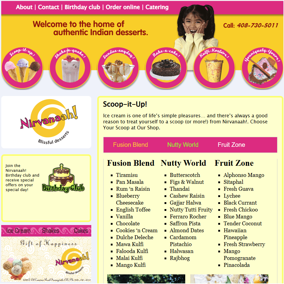
Nirvanaah's existing website - Before redesign
How I Added Value

Identified pain points in existing website, analyzed competitive solutions, and set mobile-first design goals.

Created mood boards and a style guide to ensure branding consistency across mobile and supporting mockups.

Built wireframes, designed intuitive mobile interactions, and refined UI components for better usability.

Gathered feedback from friends & family, refined the design, and defined success metrics to evaluate usability.
Results
Reduced time to find items
67% faster navigation allowing users to find items with less friction
Quicker dessert customization
Cut cake customization time by 50% making the process faster and easier
Improved mobile accessibility
Users can place orders directly without needing to call the shop
Improved user engagement
Vibrant UI leading to more engagement and more sales
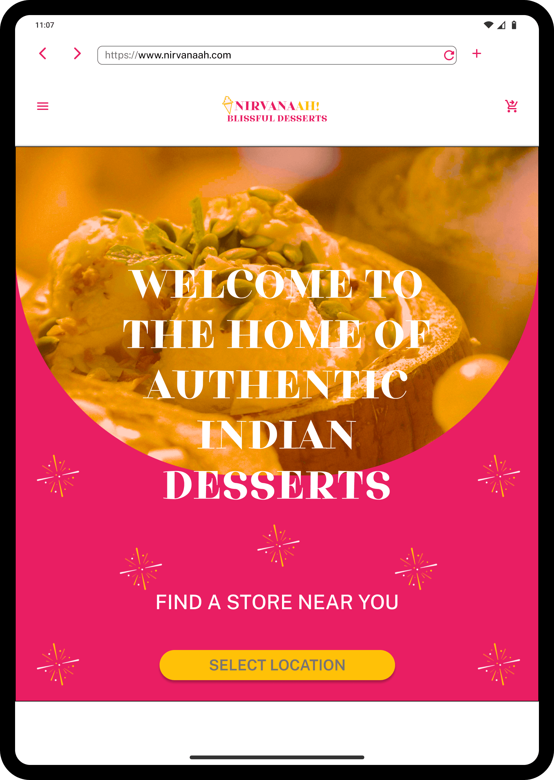
Improved online ordering experience
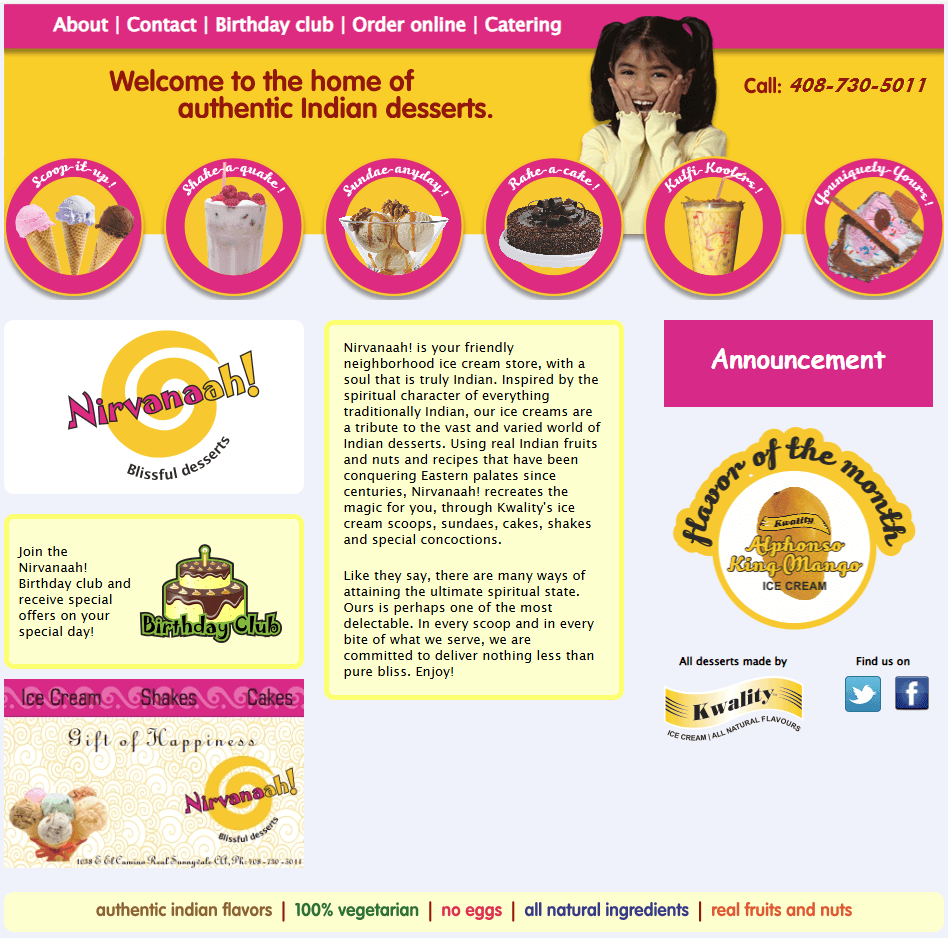
Nirvanaah's desktop only design website - Before

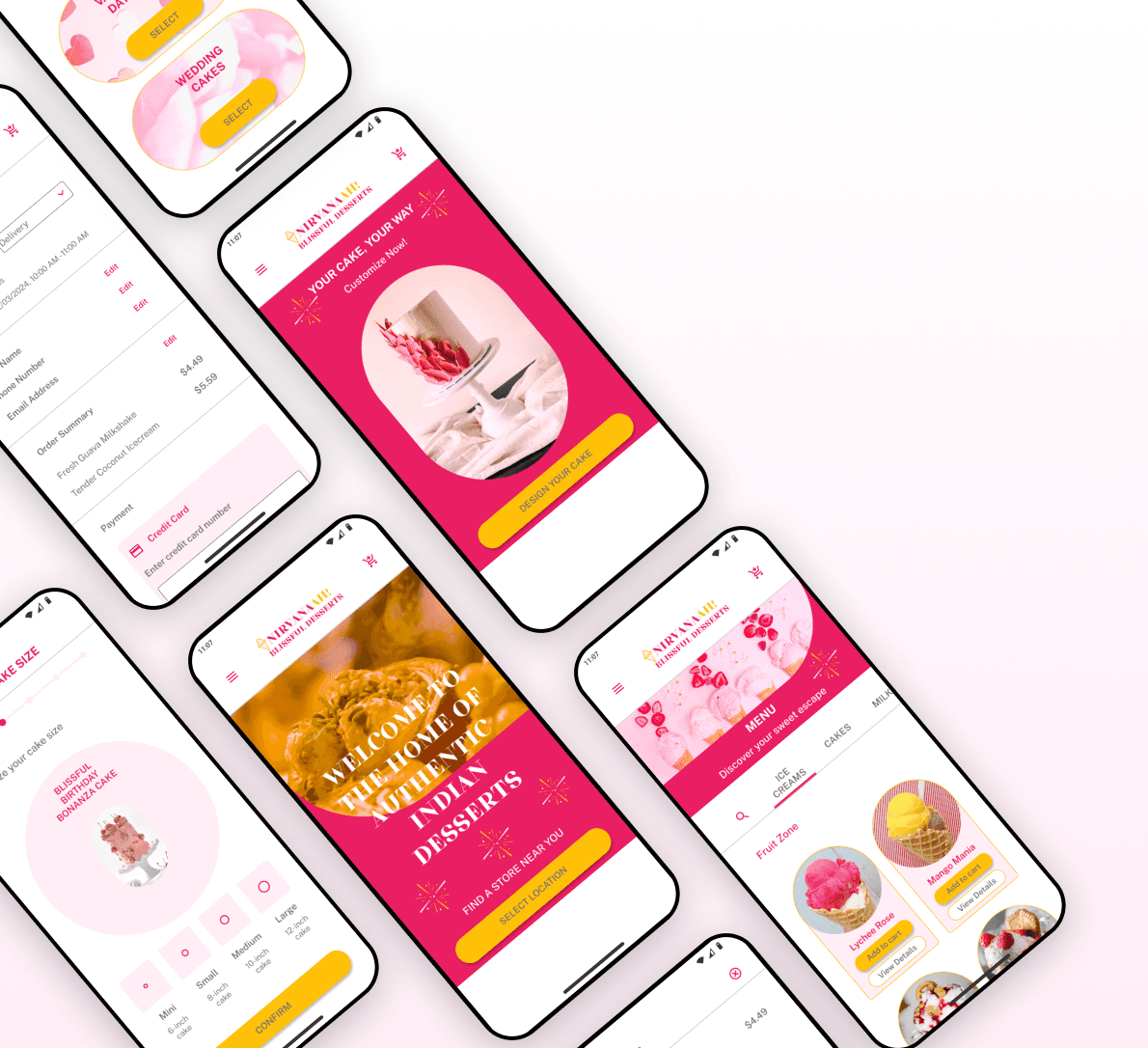
Nirvanaah's mobile-first design prototype - After redesign
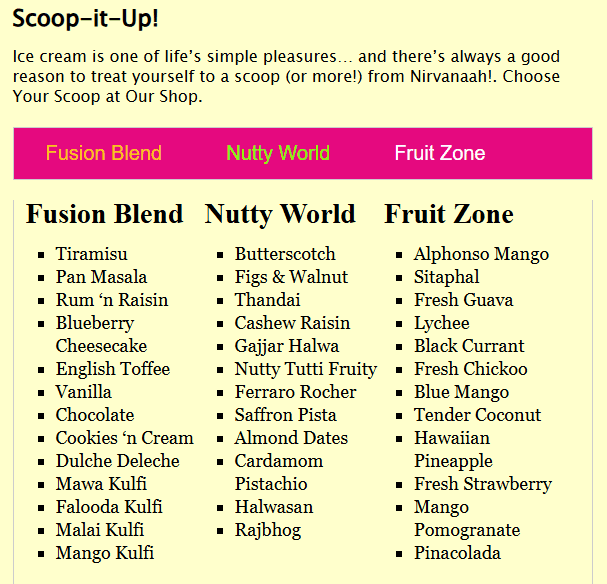
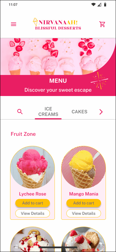
Nirvanaah's menu page - Before
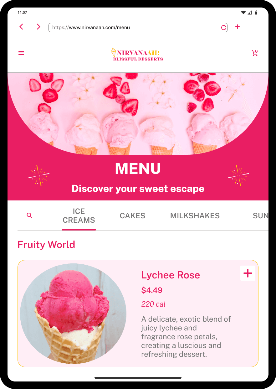
Nirvanaah's menu screen on mobile - After redesign
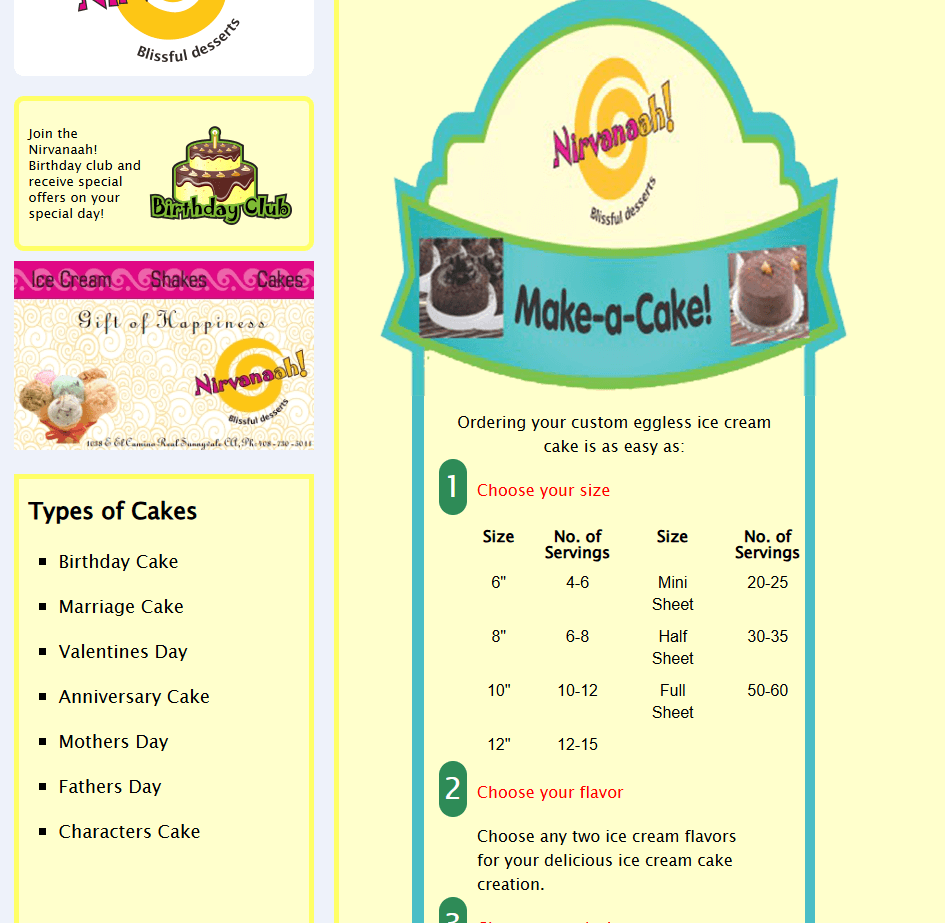
Nirvanaah's cake customization page - Before
Nirvanaah's cake customization preview on mobile - After redesign
Nirvanaah's menu page on desktop mockup - After redesign
Nirvanaah's menu page on tablet - After redesign
Sketches for a mobile-friendly interface
After deciding to implement a mobile-first approach to allow users to access the website on the go, I sketched out rough wireframes for each key screen focusing on the structure.
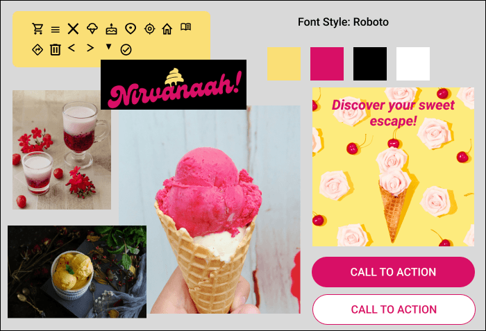
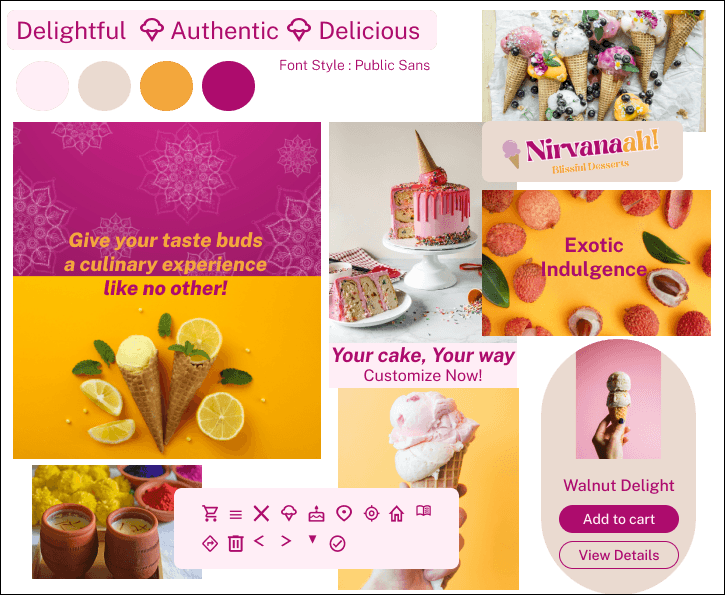
Mood Board & Branding
To define a visual style and communicate the mood of the website, I developed two mood boards.
The mood boards embody the delightful vibe with their vibrant colors, evoking the playful charm of an ice cream parlor. The imagery exudes an Indian ambiance, highlighting exotic and authentic ice cream flavors. It communicates to the users that they can discover Indian ice creams and desserts here.
Mood Board 1
Mood Board 2
Preserving existing branding
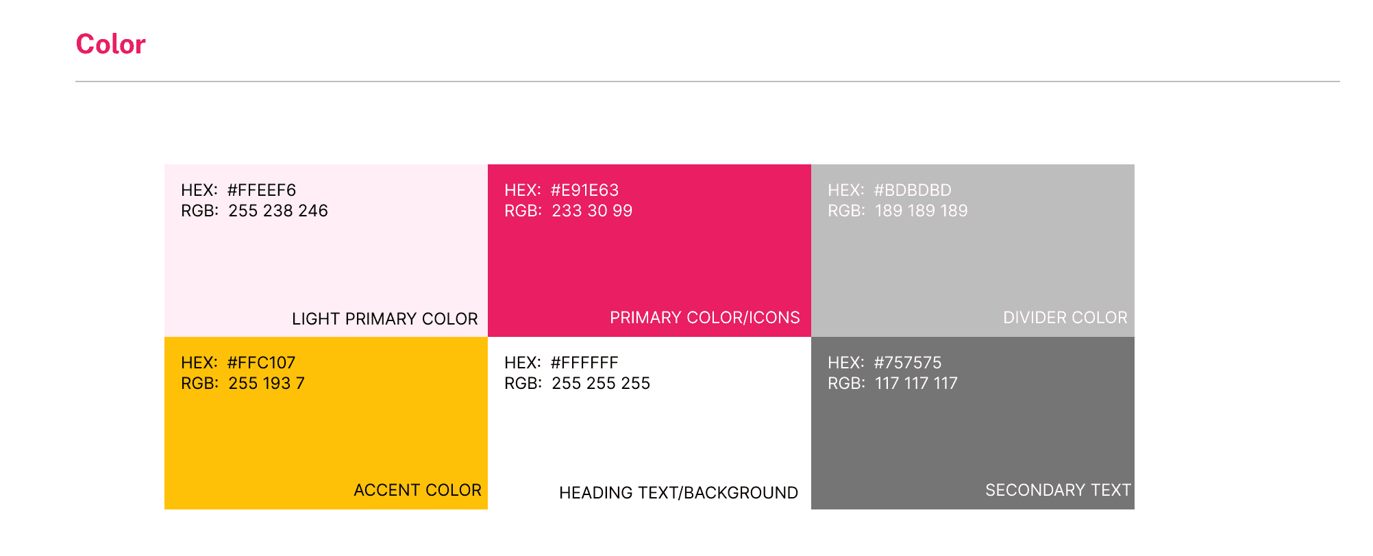
Having been a longstanding presence in the neighborhood, Nirvanaah's colors and branding are familiar to users. The mood boards closely preserve Nirvanaah's existing branding, ensuring that the colors used on the website mirror the physical shop maintaining consistency for its audience.
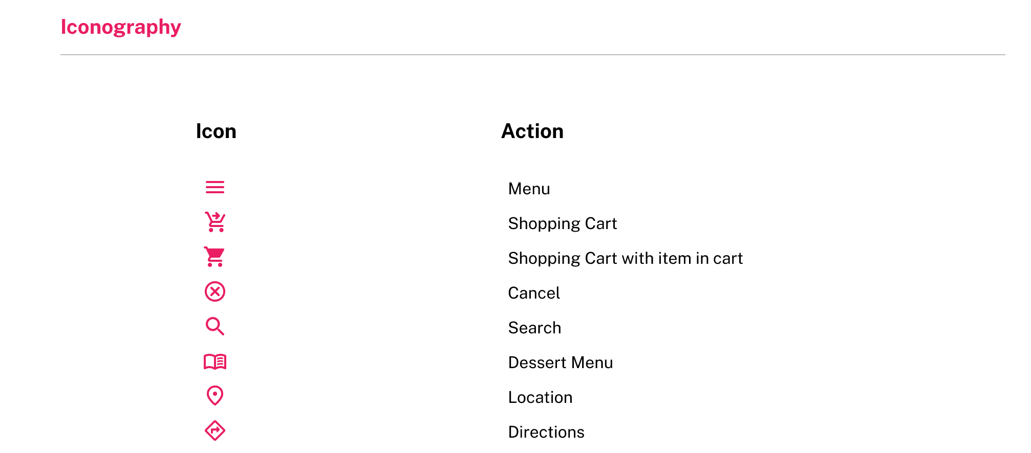
The iconography and icon colors capture the essence of the delightfulness of the desserts, while maintaining contrast with the background.
Design Decisions
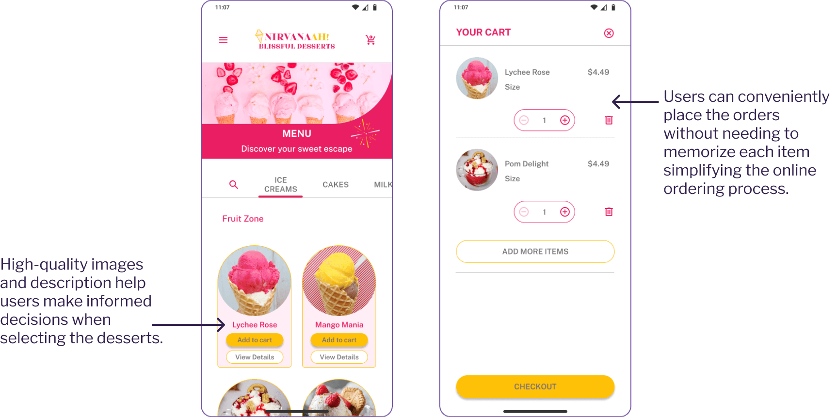
Menu Browsing and Add to Cart Experience
Before
The UI lacked mobile-friendly navigation, making it difficult for smartphone users to browse efficiently.
Users could browse dessert options, but there was no way to save selections online.
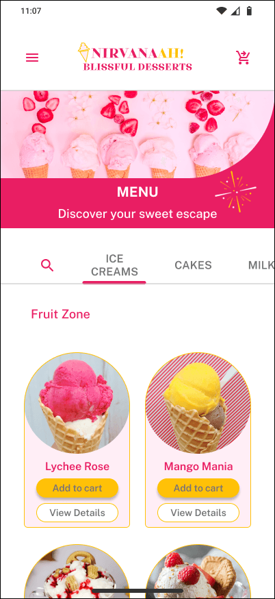
Menu page - Before
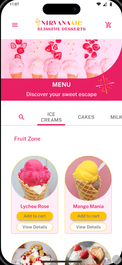
Menu Screen & Add to Cart - After
After
The new touch-friendly UI improves mobile accessibility, and the latest responsive design is now optimized for fast, intuitive interactions on mobile devices.
Users can now browse the menu and add items to their cart for easy tracking.
Menu Screen & Add to Cart - After
Enhancing User Feedback with Animations
To improve the ordering experience, I implemented animations that provide instant visual feedback when an item is added to cart.
When users click "Add to cart", instead of wondering whether their cart is updated, this instant feedback creates a sense of confidence and ease in the ordering process.
Add to cart animation
Intuitive Cake Customization
Before
Users could see cake size, favor, and design options but had to manually communicate preferences over phone.
There was no visual confirmation or saved customization before ordering.
Cake customization page - Before

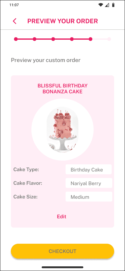
Cake customization screen on mobile - After
After
A step-by-step customization tools guides users through size, flavor, and design selection based on occasion (such as Birthday or Mother's Day)
Users get instant visual communication of their custom choices before checkout.
The feature ensures smooth self-service online ordering without relying on manual phone discussions.
I implemented a wizard experience that guides users through cake customization steps, including a summary of their selections with an 'Edit' option for making changes.
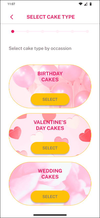
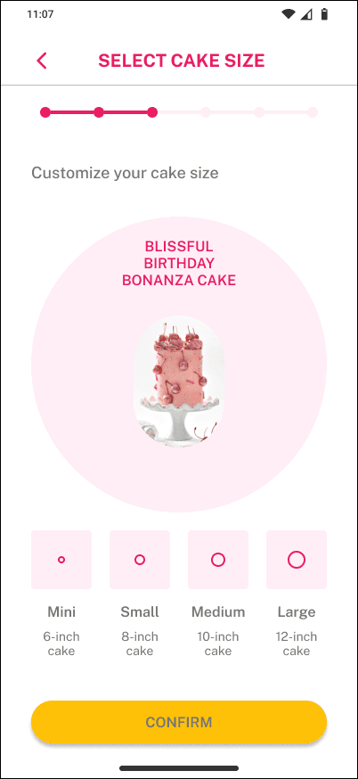
Cake customization wizard experience - After redesign
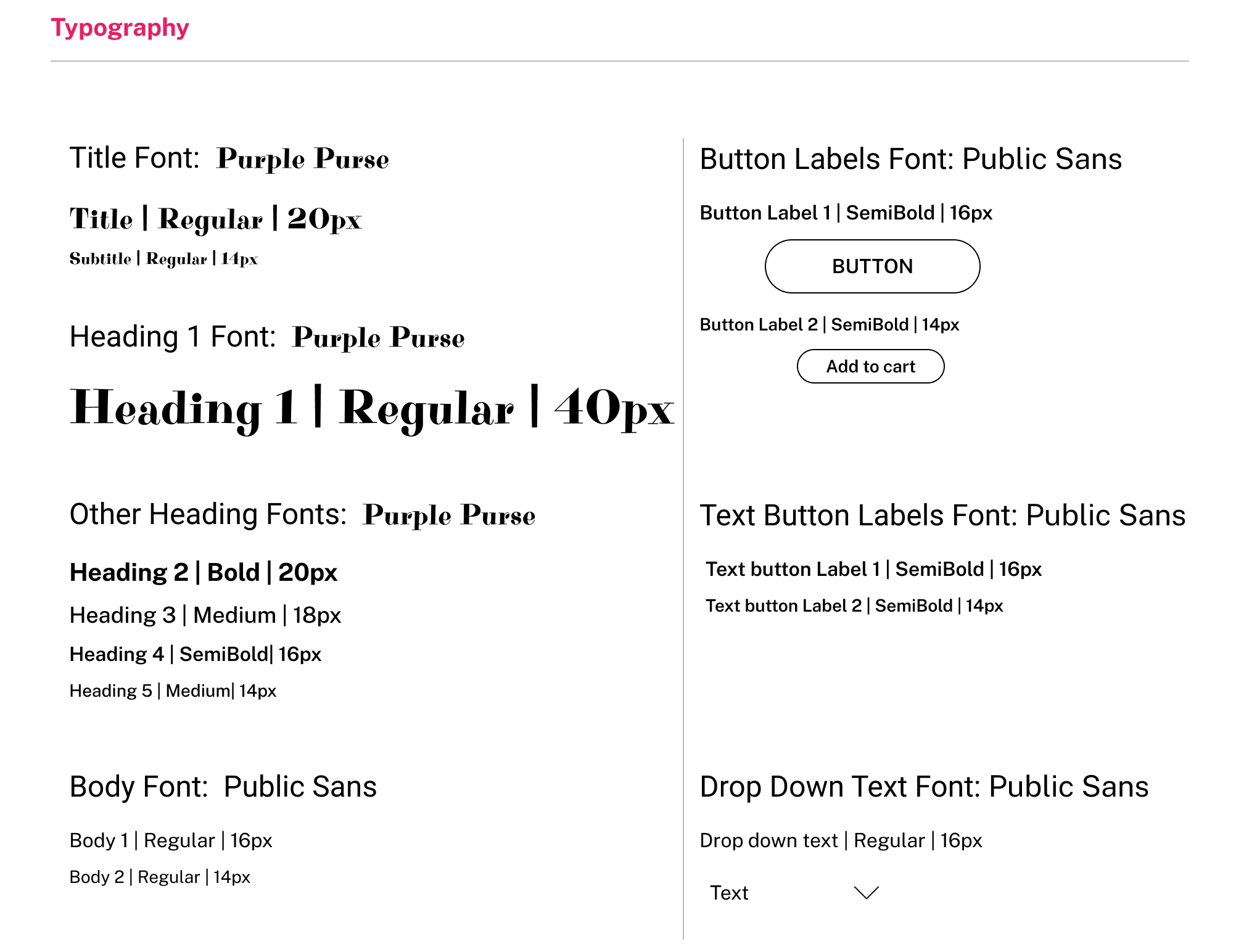
Style Guide
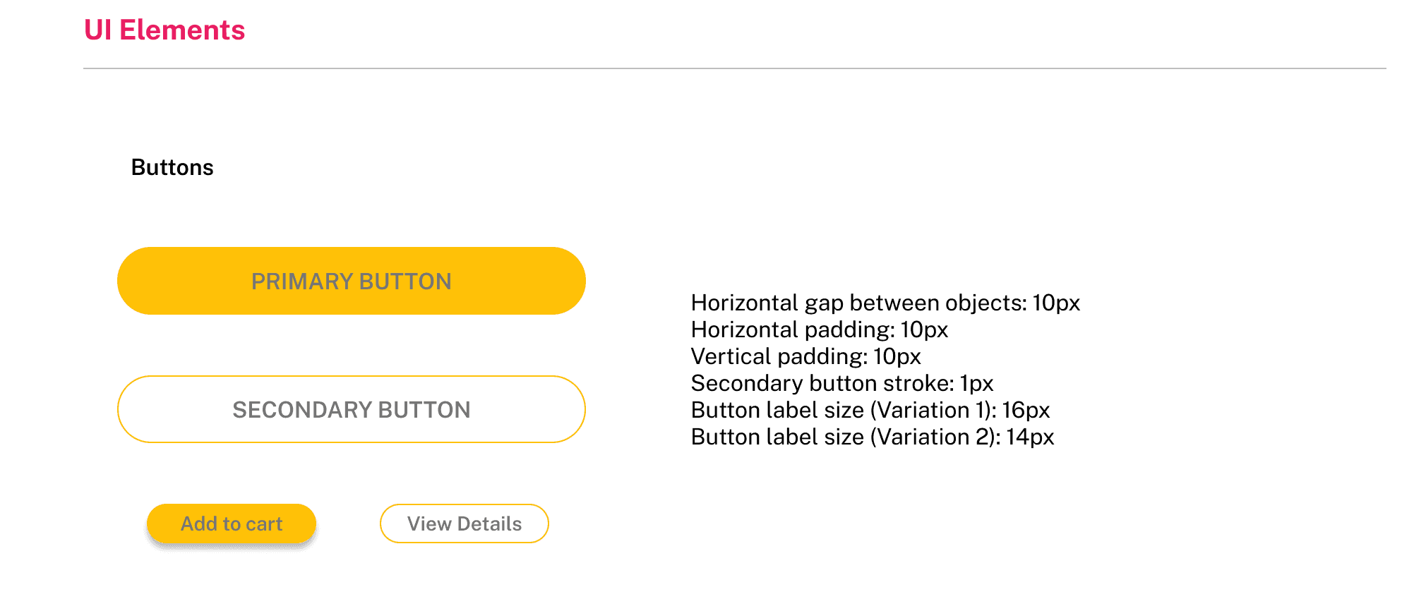
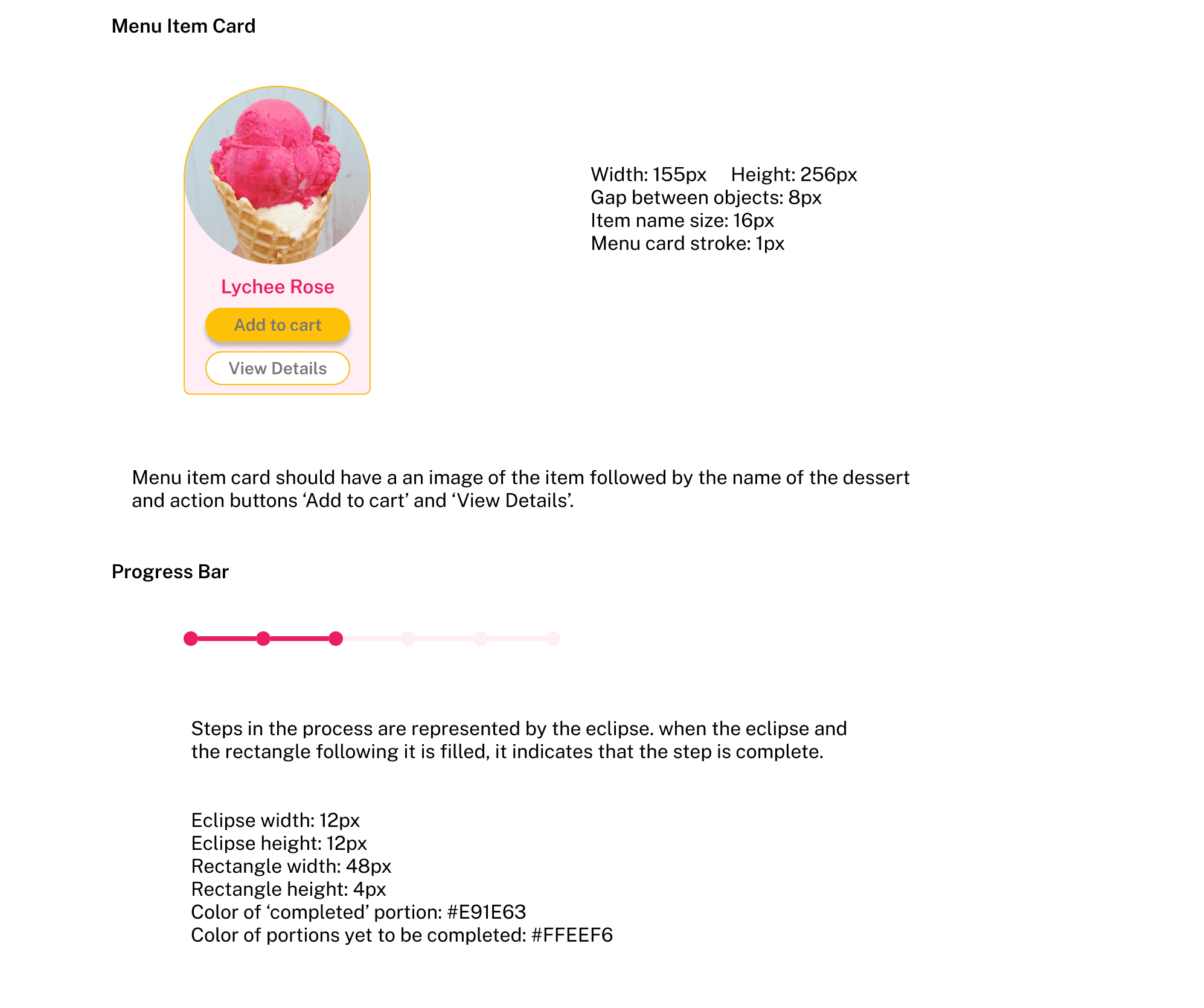
I developed a comprehensive guide documenting all UI elements and their guidelines to ensure visual consistency.

Designing for different breakpoints
Given the time constraints, I focused on mobile-first interactions for this project while ensuring consistency across devices. Although I couldn't fully design interactions for tablet and desktop breakpoints, I developed mockups for key pages, including the home page and menu page, to maintain a cohesive experience.
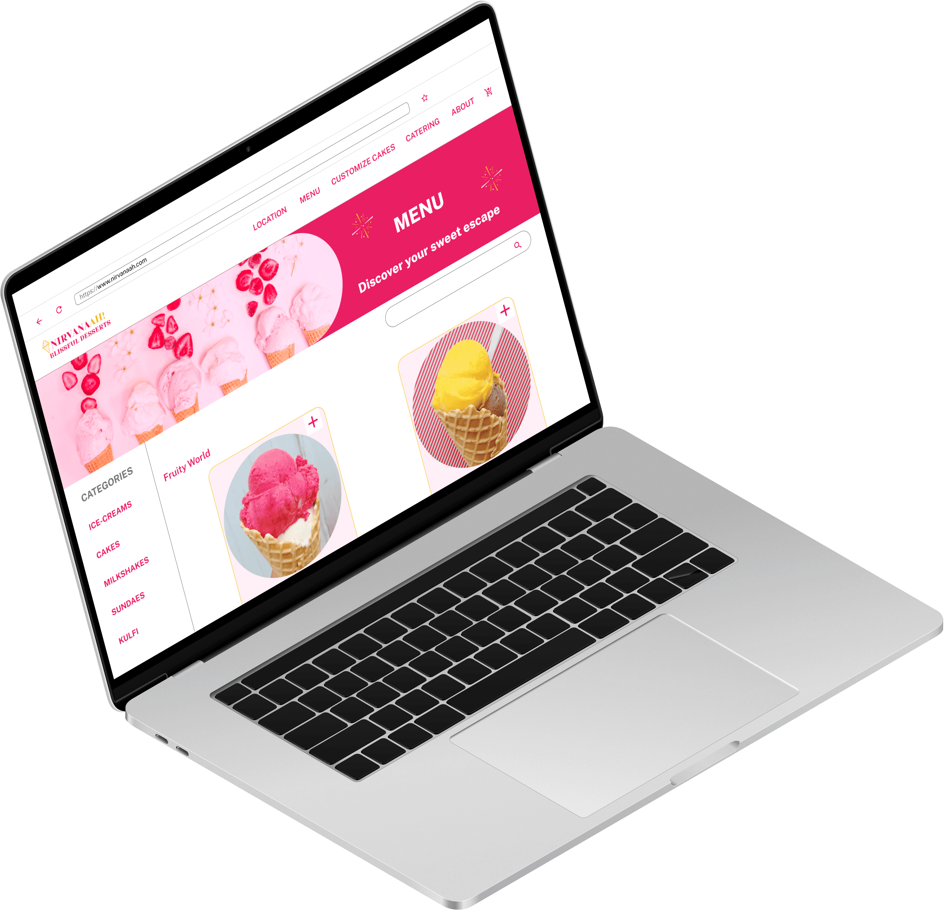
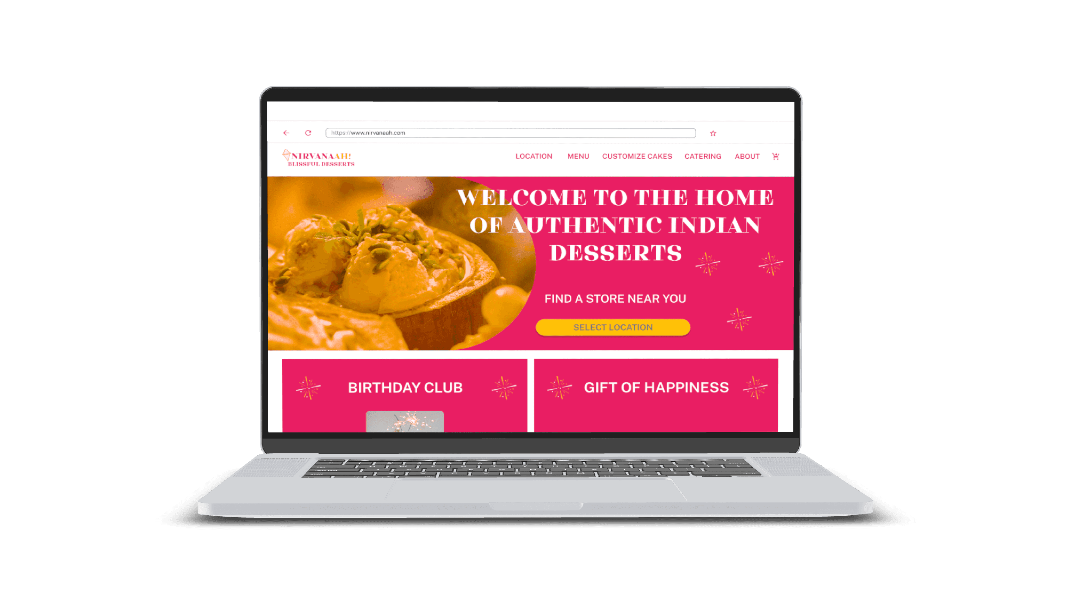
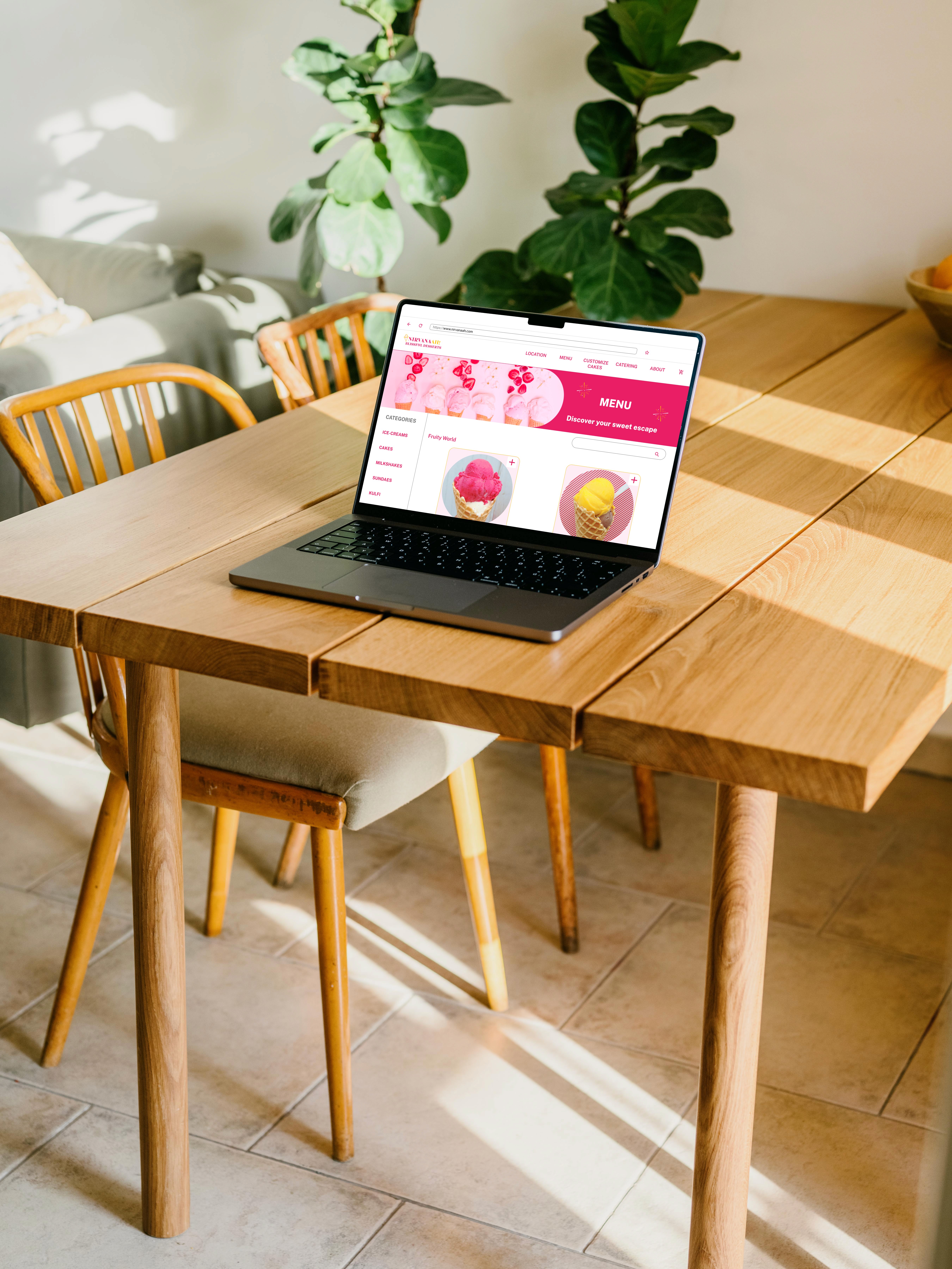
Home page and menu page on desktop
Home page and menu page on tablet
Usability testing - Validating the redesign
To assess the effectiveness of my redesign, I conducted usability testing with 5 participants focusing on ease of navigation, accessibility, and ordering efficiency.
Key testing process
Participants first explored the original website to browse items and attempt placing an order.
They then tested my redesigned version: navigating the menu, customizing cakes, and checking out.
I observed their interactions, tracking speed, and potential frustrations.
Testing results
Navigation time reduced by 67% : Users took approximately 1 minute to find the menu on the original website but 20 seconds with the redesign.
Checkout flow clarity: In the original site, users didn't know how to place an order. With the redesign, the process was straightforward and intuitive.
Cake customization efficiency: Previously users had to zoom multiple times to locate customization options, but with my redesign they completed the process in 30 seconds.
User Feedback
Conclusion
This project provided a valuable opportunity to explore and address critical user experience challenges. Additionally, it offered significant learning experiences into the UI design process. I gained an appreciation for the necessity of adopting designs for different breakpoints to maintain a consistent and visually appealing experience across devices.
